Tuesday, 21 May 2013

Who needs kidneys anyway?

My mum has always had problems with her kidneys since she was a kid but during the summer their 'functionality' dropped to a dangerous level and so it seems that she needs an extra one soon!
In the meantime she'll be starting peritoneal dialysis. Its scary stuff but shes got lots of love and support around her. 
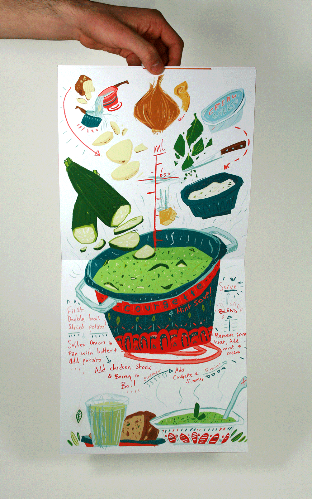
For Christmas I was browsing potential dialysis safe cookbooks (recipes with low potassium, no fresh or dried fruit and no chocolate or marmite! etc, etc and etc) And there were bugger-all nice looking or well designed books to be had. 
I think it makes the whole restricted diet thing much more depressing when the design bores you to tears so I designed a happy colourful and fun cookbook! 
Bon Appetit!


Potassium is the major baddie in this. And its in lots of stuff that everyone likes to eat lots like potato and crisps and chips and lots of fruit and veg. Its sucks. But you can get rid of it via the Double Boil. It just means meals take a little while more to make.


I actually made and tested all these recipies and the the Pantzaroslata was by far the most fun.
Lots of pink and beets!


I'm massively happy with this, its a really lovely little (actually huge) book that I can give to my mum. It's not much but it feels like something towards everything. 

(I'll get better photos up soon! Promises!)


GROW! Seed Packaging.

Hello!


These happy chaps are a range of seed packets designed to fold out and grow! 
They'd be sold to children in newsagents like Pokemon cards as an alternative to sweets and as a little gardening projects to encourage environmental awareness.
Basically there'd be some sort of compact soil within the character and then you just add water, let it grow and then plant the whole thing in the garden or a big pot!


Suspiciously carroty looking cress...


Wind in the Willows.

Last month I was tearing my hair out over a book cover for Kenneth Grahams' Wind in the Willows. I'm still nowhere near over the moon with it but I like the idea and it was a really important learning curve in regards to the work Ive produced since. 


The idea was that the cover would fold out into a map of Toads landscape allowing young children to enter the world more fully and speculate the future plot.  I was focused on creating the magic feeling you get as a kid spending hours studying the maps within books.


Tuesday, 30 April 2013

Bagatelle Comic book Cover.

So it turns out my comicbook piece for the anthology is going to be printed in black and white... sooo it was suggested that I design a possible cover for the anthology as well using the same style and colours. And here it is. Super cuffed (:


Luckily the comic book colours do convert to black and white well and the contrast means that everything is still visible and identifiable.


Thursday, 25 April 2013

Terry Reid - Brickyard Poster

Finished Terry Reid poster.


Without being all 'my life is woe and I hate my work' I honestly feel awful about this design. More the finish than the design. It's done now and I've learnt my lesson. I really need to work on my lines. This has got far too much texture and spontaneity, which is usually a good thing in my work but here it ruins the illustration. baghh.


Wednesday, 24 April 2013

Groovy.

Working out colour for a psychedelic gig poster. Not feeling it yet. 


 I like the one above but I don't feel like its got enough 'finish' to send it over to print...

Friday, 19 April 2013

Peek!

All finished on the far eastern front! 
Go to print on monday. The laws of Repro-graphics decree that I should cry at least once and print something the wrong way up with dodgy registration marks and then cry a bit more.
Can not wait. 


Three pages to be printed into a tiny, tiny zine!

Tuesday, 16 April 2013

A Thousand Nights

I'm currently working on a short 'comic' commissioned by my tutor who worked with me on my dissertation to be published in an anthology. As my dissertation was all about the illustrated map within literature novels he suggested I explore the maps effect of taking the reader on a journey, acting as a contents page for the novel to follow.  Here I am looking at presenting a story via a non-linear narrative told solely through pictures. 

At the moment it is based loosely on Arabian Nights or A Thousand and One Nights, suggesting the inspiration or origin of each fresh nightly tale.


I'm still trying to refine my technique of combining my chunky infant school pencil drawings with digital colour. I want lovely textures of the final image but without loosing he freedom of the colour tests from the middle two images. It's difficult to find the middle ground. But so, so much fun!


Deciding on colour is hard too. I love the back and white roughs but I'm too much of a sucker for brash rub your face all over colour! Perhaps I'll go back and greyscale the finals?